布局和创建详情页
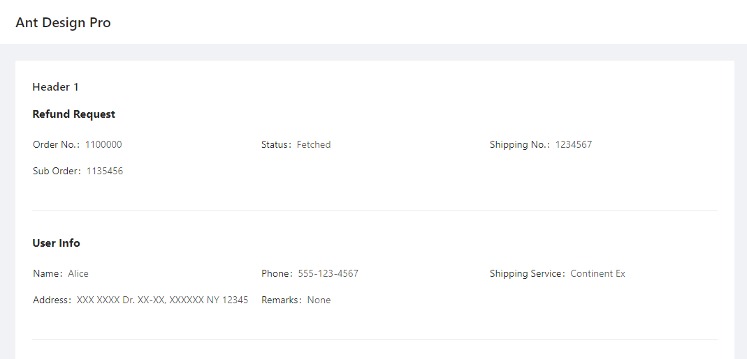
当您想在页面上显示复杂信息时,您可以使用 Card, Header, DetailGroup, DetailItem 和 Divider 来布局页面:
@app.page('/detail', 'Detail Page')
def detail_page():
    return [
        Card(content=[
            Header('Header of the record', 1),
            DetailGroup('Refund Request', content=[
                DetailItem('Order No.', 1100000),
                DetailItem('Status', "Fetched"),
                DetailItem('Shipping No.', 1234567),
                DetailItem('Sub Order', 1135456)
            ]),
            Divider(),
            DetailGroup('User Info', content=[
                DetailItem('Name', "Alice"),
                DetailItem('Phone', "555-123-4567"),
                DetailItem('Shipping Service', 'Continent Ex'),
                DetailItem('Address', 'XXX XXXX Dr. XX-XX, XXXXXX NY 12345'),
                DetailItem('Remarks', "None")
            ]),
        ])
    ]
它看起来像这样:
-
class
adminui.DetailGroup(title='', content=None, bordered=False, column=3, size=False, layout='horizontal', id=None)¶ DetailItem的容器,用于显示具有多个字段的记录
参数: - title – DetailGroup的标题
- content – 一个包含DetailItem的列表
- bordered – show a bordered description list, see https://3x.ant.design/components/descriptions/
- size – default | middle | small - the size of the table when in bordered mode
- column – number of columns shown in the list
- layout – horizontal | vertical s
-
class
adminui.DetailItem(title='', value='', id=None)¶ 带有标题和值的简单文本,用于在记录中显示字段
参数: - title – 字段的标题
- value – 字段的值
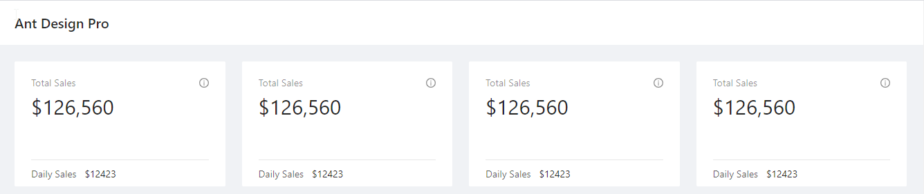
如果您正在做仪表盘,可以使用 Row, Column, Statistic。ChartCard 会显示一个用于展示数字和图表的区域,如:
@app.page('/dashboard', 'Dashboard')
def dashboard_page():
return [
    Row([
        Column([
            ChartCard('Total Sales', '$126,560', 'The total sales number of xxx', height=50,
                footer=[Statistic('Daily Sales', '$12423', inline=True)])
        ]),
        Column([
            ChartCard('Total Sales', '$126,560', 'The total sales number of xxx', height=50,
                footer=[Statistic('Daily Sales', '$12423', inline=True)])
        ]),
        Column([
            ChartCard('Total Sales', '$126,560', 'The total sales number of xxx', height=50,
                footer=[Statistic('Daily Sales', '$12423', inline=True)])
        ]),
        Column([
            ChartCard('Total Sales', '$126,560', 'The total sales number of xxx', height=50,
                footer=[Statistic('Daily Sales', '$12423', inline=True)])
        ]),
    ])
]
它会产生这样的页面:
If you just want to display some text, use Paragraph. You may set the color of the Paragraph:
Paragraph("The text of Paragraph", color="red")
If you wish to format rich text or other complex content, you may use RawHTML Element. Beware this is dangerous because if you pass unfiltered user text (e.g. from a piece of user inputted text stored in the database), this user text may contain dangerous code that may run on the client’s computer:
RawHTML('a raw <font color="red">HTML</font>')
下面是与布局相关的类:
-
class
adminui.Card(title=None, content=None, id=None)¶ 显示一个白色的框,作为容器
参数: - title – 容器的标题
- content – 将在容器内显示的页面元素的列表
-
class
adminui.Header(text='', level=4, id=None)¶ 在屏幕上显示标题文本
参数: - text – 标题的文本正文
- level – 标头级别。级别 =1 表示第一级标头 (h1)
-
class
adminui.Paragraph(text='', id=None, color=None)¶ 显示文本段落
-
class
adminui.Row(content=None, id=None)¶ 用于布局的行元素,可以有多个Columns(列)
行的宽度将自动由 len(content) 计算。例如,包含四列的行将构成 4 列布局。自动适配小屏幕和移动设备。
参数: content – 列对象列表
-
class
adminui.Column(content=None, size=1, id=None)¶ 多列布局行中的列
参数: - content – 一个页面元素的列表
- size – 列宽度的”权重”。例如,两个size=1 的列具有相同的宽度;但 size=2 的列和 size=1 的列将构成2比1的宽度布局。
-
class
adminui.ChartCard(title=None, value=None, tooltip=None, footer=None, content=None, height=46, id=None)¶ 带有值、工具提示和页脚的卡片容器。主要用于仪表盘
参数: - title – 容器标题
- value – (str),卡片上显示的大字
- tooltip – 当用户在工具提示图标上悬停时显示的文本
- footer – 页面元素列表,将在卡片页脚上显示
- content – 页面元素列表,将作为卡片内容显示
- height – 高度,使格列的卡片看起来同高
-
class
adminui.Statistic(title='', value=0, show_trend=False, inline=False, id=None)¶ 用于显示统计数字的文本片段,可能包括一个小趋势箭头(向上或向下)
参数: - title – 统计数字的标题
- value – 数字本身
- show_trend – 如果设置为 True,则数字为正数时出现上箭头,为负数时出现下箭头
- inline – 如果设置为 True,则标题和值将位于同一行中,而且使用小字体