Other Components
Icons
You can add one of the Ant Design icons using Icon:
Icon('sync')
A full list can be seen at: https://3x.ant.design/components/icon-cn/
only outline style icons are supported.
You may set the color and size of the icon.
-
class
adminui.Icon(name='', color='rgba(0, 0, 0, 0.8)', size=16, rotate=False, spin=False, id=None)¶ Display an Ant Design Icon
参数: - name – name of the icon, see https://ant.design/components/icon/ for a detailed list
- color – color of the icon
- size – (font) size of the icon
- rotate – (bool)rotation angle of the icon
- spin – (bool)whether the icon is spinning
Group (HTML Div)
Use Group to group content together, so you may change them with
UpdateElement page action
(in fact, it just creates a <div/> element in html):
Group(id='id of the content', content=[...content in the group])
Tabs
Use tabs to group content together:
Tabs([
    Group(name='title of tab 1', content=[
        ... content of tab 1
    ]),
    Group(name='title of tab 2', content=[
        ... content of tab 2
    ]),
]),
You may set the tab appearance with position, format, and size, see
-
class
adminui.Tabs(content=[], position='top', format='line', size='default', id=None)¶ Display a group of tabs. Each content item is a tab
参数: - position – top | left | bottom | right, where the tab is (decide if it’s horizontal or vertical)
- format – line | card - the style of the tabs
- size – default | large | small
Spin

Creates a spinning wheel:
Spin()
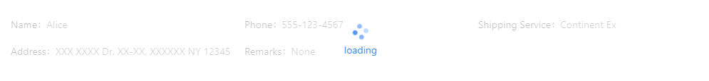
You can also setup a region masked under a spinning wheel. When the loading is done, remove it with Page Actions:
Spin('loading', content=[
    ... content under the mask...
]),
-
class
adminui.Spin(title='', content=[], size='default', id=None)¶ A spinning icon, indicating something is loading
参数: - size – default | small | large: the size of the spinning wheel
- content – (optional), when creating a container with a “loading” mask, put its content here
- title – the text shown below the spinning wheel
Empty Status
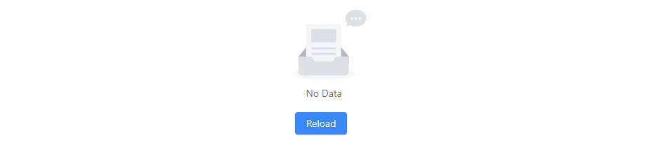
Display the empty status:
Empty()
-
class
adminui.Empty(title=None, content=[], simple_style=False, id=None)¶ Display an Empty status
参数: - title – the description text shown on the empty indicator
- content – (optional), put additional buttons or elements below the icon
- simple_style – set True to deploy a simple style of empty box
Result
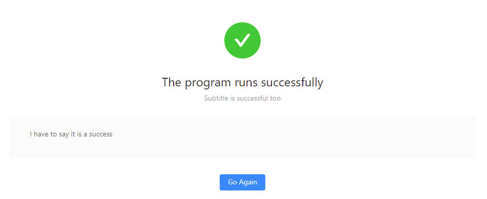
Display the result of an operation:
Result('The program runs successfully')
-
class
adminui.Result(title=None, status='success', sub_title=None, content=[], extra=[], id=None)¶ Display the result (success, failure, 403, 404…) of an action
参数: - title – the title of the result feedback
- sub_title – the sub-title of the result section
- status – ‘success’ | ‘error’ | ‘info’ | ‘warning’| ‘404’ | ‘403’ | ‘500’
- content – put additional buttons or elements inside a result box
- extra – extra action buttons on the result section
Popconfirm
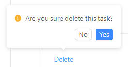
Let the user confirm before performing an action:
Popconfirm('Are you sure to do something?', on_submit=on_submit, content=[
    ... put adminui elements here, which will trigger the confirm box when clicked ...
], data=CUSTOM_DATA)
note that CUSTOM_DATA may be passed to the on_submit callback, when the user choose YES
in the confirm box.
You may customize the OK and Cancel button of the pop confirm box by setting ok_text and
cancel_text of the element
-
class
adminui.Popconfirm(title=None, content=[], on_submit=None, ok_text='Yes', cancel_text='No', data=None, id=None)¶ Before the user perform an action, ask him/her to confirm twice.
参数: - title – the text shown on the pop confirm box
- content – the enclosed content, which shows the Popconfirm when clicked
- on_submit – (func) callback after user clicked ‘ok’
- ok_text – text shown on the OK button
- cancel_text – text shown on the Cancel button
- data – data which will passed as the parameter to the callback
Tooltip
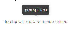
Display a tooltip when the mouse is hovering some elements:
Tooltip('Text on the tooltip', [
    ... content which will trigger the tooltip when hovered ...
])
-
class
adminui.Tooltip(title=None, content=[], placement='top', id=None)¶ Show a tooltip when the user moves the mouse upon its content
参数: - title – the text shown on the tooltip
- content – the content, which will show the tooltip when the mouse is on it
- placement – one of top | left | right | bottom | topLeft | topRight | bottomLeft | bottomRight | leftTop | leftBottom | rightTop | rightBottom