创建表单
若要创建表单,插入一个 Form 对象:
@app.page('/', 'Form')
def form_page():
    return [
        Form(on_submit = my_function,
               content = [ ... content of the form ... ])
    ]
这里可以传递一个函数来处理用户提交的数据。此函数需要有一个参数,是以字典表示的用户填写的表单的值:
def my_function(values):
    ... do things with values ...
In the content section of the form, you may add TextField and other form controls. See
the next section for details
最后,不要忘记添加一个提交按钮。在窗体末尾插入``FormActions`` 对象,并在其末尾插入 Submit:
FormActions(content = [
    SubmitButton('Submit')
])
这样,就完成了一个表单。
List of Form Controls
Here are a list of controls you may use in your form:
TextField
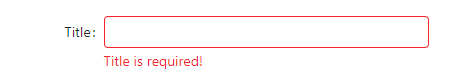
TextField('Title', required_message='Title is required!')
Set password=True to setup a password field:
TextField('Enter Password', password=True)
-
class
adminui.TextField(title, name=None, required_message=None, password=False, disabled=False, value=None, placeholder=None, on_change=None, id=None)¶ 在表单中创建文本字段。
参数: - title – 字段的标题
- name – 提交表单时传递给回调的字典数据的键
- required_message – if other than None, the field will be required and an message will be shown when the field is not filled at form submission.
- placeholder – the text message shown when the field is not filled.
- password – set to True if it’s a password box
- disabled – set to True to make the control disabled
TextArea
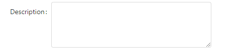
TextArea('Description')
-
class
adminui.TextArea(title, name=None, required_message=None, value=None, placeholder=None, disabled=False, on_change=None, id=None)¶ 创建文本区域对象
参数: - title – 字段的标题
- name – 提交表单时传递给回调的字典数据的键
- required_message – if other than None, the field will be required and an message will be shown when the field is not filled at form submission.
- placeholder – the text message shown when the field is not filled.
- disabled – set to True to make the control disabled
Select
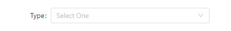
SelectBox('Type', data=['One', 'Two', 'Three'], placeholder="Select One")
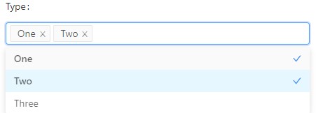
# use multiple=True to allow multiple selecting:
SelectBox('Type', data=['One', 'Two', 'Three'], placeholder="Select Many", multiple=True)
# use tags=True to input tags - users can input arbitrary text as a tag:
SelectBox('Type', data=['One', 'Two', 'Three'], placeholder="Select Many", tags=True)
-
class
adminui.SelectBox(title, name=None, value=None, data=[], placeholder=None, on_change=None, required_message=None, multiple=False, disabled=False, tags=False, id=None)¶ Create a dropdown box for selecting in a list
参数: - title – 字段的标题
- name – 提交表单时传递给回调的字典数据的键
- required_message – if other than None, the field will be required and an message will be shown when the field is not filled at form submission.
- data – the options in the select box. in format of a list of str or a list of [title, value] list e.g. [‘one’, ‘two’, ‘three’] or [[‘one’, 1], [‘two’, 2]], both accepted
- placeholder – the text message shown when the field is not filled.
- disabled – set to True to make the control disabled
Checkboxes

CheckboxGroup('Checks', data=['One', 'Two'])
-
class
adminui.CheckboxGroup(title, name=None, data=[], value=None, disabled=False, id=None, on_change=None)¶ Create a group of checkbox for multi-selecting
参数: - title – 字段的标题
- name – 提交表单时传递给回调的字典数据的键
- data – the title and value of individual checkboxes. in format of a list of str or a list of [title, value] e.g. [‘one’, ‘two’, ‘three’] or [[‘one’, 1], [‘two’, 2]], both accepted disabled: set to True to make the control disabled
Radios
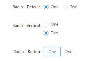
RadioGroup('Radio - Default', data=['One', 'Two'], on_change=on_change),
RadioGroup('Radio - Vertical', data=[['One', 1], ['Two', 2]], on_change=on_change, format='vertical'),
RadioGroup('Radio - Button', data=[['One', 1], ['Two', 2]], on_change=on_change, format='button'),
-
class
adminui.RadioGroup(title, name=None, data=[], value=None, format='default', disabled=False, on_change=None, id=None)¶ Create a group of radio buttons
参数: - title – 字段的标题
- name – 提交表单时传递给回调的字典数据的键
- value – the default value of the selected radio
- data – the title and value of individual checkboxes. in format of a list of str or a list of [title, value] e.g. [‘one’, ‘two’, ‘three’] or [[‘one’, 1], [‘two’, 2]], both accepted
- format – default | button; how the radio box is displayed and arranged
- disabled – set to True to make the control disabled

Callback when form item changes
If you want to do something, say update a part of the page when user select an item in the SelectBox or input text on the TextFields, you may add on_change handlers in your Python code:
TextField('Title', required_message='Title is required!', on_change=on_change),

# for the handler:
def on_change(value, values):
    print(value)
    print(values)
See chapter 页面操作. for details on what can handlers do.
The handler could be a function taking one or two parameters: the first will be the new value of the form item; the second one will be a dictionary of all the values in the form where the form item lives. This will be useful for example when your data shown in the page is filtered by a list of criterions.
Slider, Switch and other controls
These are not form controls. But they respond to on_change handlers.
Slider
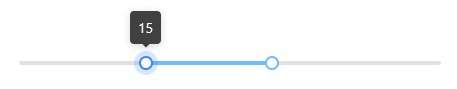
Slider(on_change=on_change)
# this will render a slider, with 0~50 range
# and user can pick up a range, with an initial value 20~30
Slider(0, 50, range=True, value=[20,30])

Checkbox
Checkbox(on_change=on_change)