Use Data Tables
A table page looks like this:
@app.page('/', 'Table')
def table_page():
    return [
        Card(content = [
            DataTable("Example Table", columns=table_columns,
                data=TableResult(table_data))])
    ]
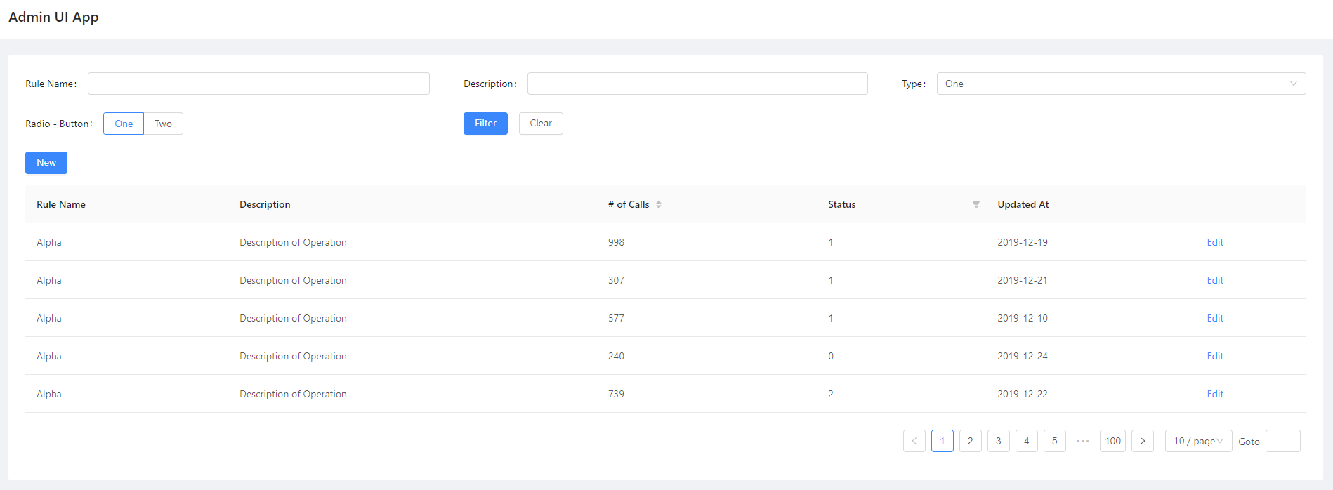
We use DataTable class to construct a table with data:
-
class
adminui.DataTable(title='', columns=[], data=[], row_actions=[], table_actions=[], filter_form=None, on_data=None, size='default', scroll_x=None, scroll_y=None, id=None)¶ Insert a data table to the page
Parameters: - title – the title of the table
- columns –
a list-of-dictionaries as column definition. e.g.: [ {‘title’: ‘Rule Name’, ‘dataIndex’: ‘name’}, …other columns] [ {‘title’: ‘Rule Name’, ‘dataIndex’: ‘name’, ‘sorter’: True, ‘filterOptions’: [‘abc’, ‘def’]}, …other columns] for each column,
title: the column title dataIndex: its key for the TableResult data dictionary (optional) sorter: (True/False) the column is sortable (optional) filterOptions: ([strings]) a list of options shown as filters (optional) linkTo: display the data as a link to another field of the dataIndex specified (optional) status: dataIndex of another column, shown as the status badge fo the data. The value of the other column must be one from success | processing | default | error | warning - data – a TableResult object for the initial data of the table
- row_actions – a list of TableRowAction objects, which means actions shown on each row. Leave it blank if you don’t need any action
- table_actions – a list of page elements shown on top of the table. Controls such as “New Item” buttons could be listed here.
- on_data – a callback function that returns a TableResult object if the user turns a page. an argument will be passed as {‘current_page’:…, ‘page_size’:…, ‘sorter’: {sorted_column_data_index}_{ascend|decsend}} Leave it None if you’re sure there is only one page of data.
- size – size of the table (default | middle | small)
Prepare data for a Table
DataTable needs a column definition and a data parameter. the data required in the columns field looks like this:
table_columns = [
    {'title': 'Rule Name', 'dataIndex': 'name'},
    {'title': 'Description', 'dataIndex': 'desc'},
    {'title': '# of Calls', 'dataIndex': 'callNo'},
    {'title': 'Status', 'dataIndex': 'status'},
    {'title': 'Updated At', 'dataIndex': 'updatedAt'}
]
each column is a dictionary, with title and dataIndex.
dataIndex will be used as the key of the provided table rows data:
table_data = [
                "callNo": 76,
                "desc": "Description of Operation",
                "id": 0,
                "name": "Alpha",
                "status": 3,
                "updatedAt": "2019-12-13"
            },
            ... other rows
]
table_data need to be passed with a TableResult object:
DataTable("Example Table", columns=table_columns,
                data=TableResult(table_data))
TableResult will also be used in case of pagination.
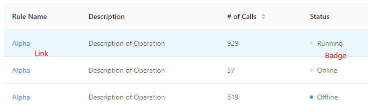
Render a column as a link
If you want a column in the table shown as a link, set the column definition as:
{'title': 'Rule Name', 'dataIndex': 'name', 'linkTo': 'link'},
Then the column’s title will be shown as a link, linking to data field
with key link
Render a column as a badge
To render badges on columns, define the column as:
{'title': 'Rule Name', 'dataIndex': 'name', 'status': 'badgeStatus'},
Whereas badgeStatus in the example is the dataIndex of another column,
whose value takes from success | processing | default | error | warning,
which will be the appearance of the badge.
Pagination
In case you have multiple pages of data for the table and you can only display some in a page (for example, records read from a database), you’ll need pagination.
You need to do two things:
First, fill TableResult with information such as total number of records,
current page and page size. So the table knows how many page buttons it should
display to the user:
DataTable("Example Table", columns=table_columns,
            data=TableResult(table_data, 1000), on_data=on_page)
-
class
adminui.TableResult(data=[], total=None, current_page=1, page_size=10)¶ Table data used in the “data” column of DataTable, or returned when table pages are requested
Parameters: - data – a list of dictionary serves as table data. e.g.: [ {id: 1, name: ‘Alice’, ‘_actions’: [‘view’, ‘edit’], … more fields} …more rows of data] id is required as a data record. ‘_actions’ fields dictates which action is available for this row. If omitted, all actions will be available; an empty list means no actions.
- total – the total number of records available, may be more than len(data), at which time a pagination bar will be shown.
- current_page – the current page of the record, so the frontend will know which page to highlight
- page_size – how many records are there in a page.
Second, provide a on_data callback function to DataTable, so AdminUI
knows what data to load when the user turns a page:
def on_page(args):
    records = (... load records somewhere from the database,
        with args['current_page'] and args['page_size'])
    return TableResult(mock_table_data(5), 1000, args['current_page'])
Now you have a table serving multi-paged data.
Action Links for each Row
You may also add an action link to each row. This is useful when the user can do something to the records. For example, for a table of articles, the user may wish to edit a single one.
In this case, fill the row_actions argument with a list of TableRowAction:
DataTable("Example Table", columns=table_columns,
                data=TableResult(table_data)
                row_actions=[
                    TableRowAction('edit', 'Edit', on_click=on_edit),
                    TableRowAction('edit', icon='edit', on_click=on_edit), # use icons
                ])
-
class
adminui.TableRowAction(id, title='', on_click=None, icon=None)¶ Represent an action link shown in each row of the table
Parameters: - id – the id of the action, used in the ‘_actions’ field of TableResult data.
- title – the title of the action link
- on_click – the callback function called when the user clicked the link. the data row will be passed as the argument of the function
In this case, an “Edit” link will be shown on the right side of each row of the table.
If the user clicks one of them, the passed function on_edit will be called:
def on_edit(record):
    ...do something with the table record
Use Filter Forms
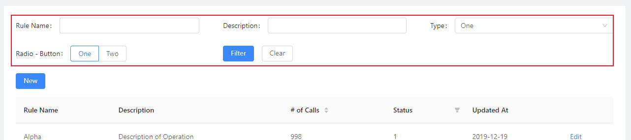
You may add a filter form, to let users search in your table.
Each time the user submits the form or switch pages, values in the form will be passed
along to the on_data callback.
To add filter form, set filter_form field in DataTable element:
DataTable("Example Table", columns=...,  data=..., on_data=on_page,
            filter_form=FilterForm([
                TextField('Rule Name'),
                TextField('Description'),
                SelectBox('Type', data=['One', 'Two', 'Three'], placeholder="Select One"),
                RadioGroup('Radio - Button', data=[['One', 1], ['Two', 2]], format='button'),
            ], submit_text='Filter', reset_text='Clear'),
            row_actions=[...],
            table_actions=[...])
Note that you can change the text on submit button and reset button, using
submit_text and reset_text field.
Sortable and Filterable Columns
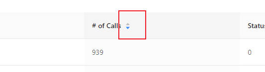
To make table column sortable, set sorter=True to the column definition:
table_columns = [
    {'title': '# of Calls', 'dataIndex': 'callNo', 'sorter': True},
    ...
]
Then, when the user click on the header of the column, on_data callback will
receive an additional sorter argument like:
sorter: "callNo_descend"
Separated by underscore, the first part is the dataIndex field,
the second part is descend or ascend according the current sorting status.
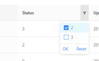
To make a table column filterable, set filters on the column definition like:
{'title': 'Status', 'dataIndex': 'status', 'filters': [{'text': 2, 'value': 2}, {'text': 3, 'value': 3}]},
Then the column will be filterable. When the user filters some columns, on_data
will receive arguments like:
filters: {status: "3,2"}
where the key will be the filtered column’s data index, and the value will be the filtered values, separated by commas.
Change the height of rows
pass size to DataTable will allow you to change the row height.
You may choose from 'default' | 'middle' | 'small':
DataTable(..., size='small')
Scroll X for the table
setting the scroll_x and scroll_y attributes for DataTable,
will let scroll bar show up when the table is too long. Useful
for tables with many columns or rows:
DataTable(..., scroll_x=1000)
A complete example of table is listed here https://github.com/bigeyex/python-adminui/blob/master/python/example_table.py