Layout and Creating a Detail Page
When you want to show complex information on the page, you may use Card, Header,
DetailGroup, DetailItem and Divider to help you format the page:
@app.page('/detail', 'Detail Page')
def detail_page():
return [
Card(content=[
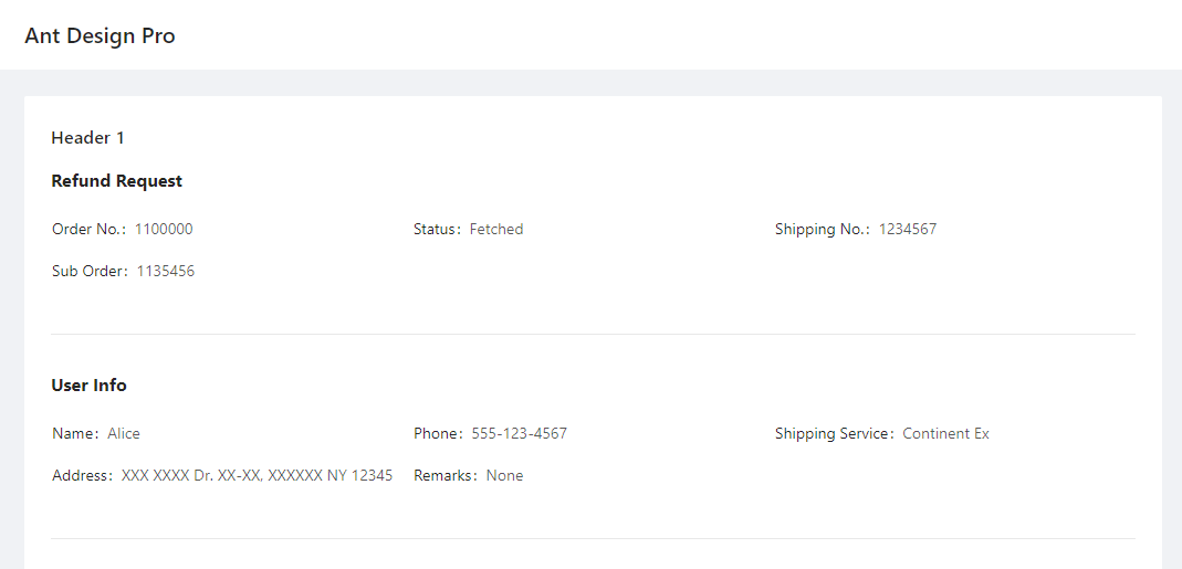
Header('Header of the record', 1),
DetailGroup('Refund Request', content=[
DetailItem('Order No.', 1100000),
DetailItem('Status', "Fetched"),
DetailItem('Shipping No.', 1234567),
DetailItem('Sub Order', 1135456)
]),
Divider(),
DetailGroup('User Info', content=[
DetailItem('Name', "Alice"),
DetailItem('Phone', "555-123-4567"),
DetailItem('Shipping Service', 'Continent Ex'),
DetailItem('Address', 'XXX XXXX Dr. XX-XX, XXXXXX NY 12345'),
DetailItem('Remarks', "None")
]),
])
]
It looks like this:
-
class
adminui.DetailGroup(title='', content=None, bordered=False, column=3, size=False, layout='horizontal', id=None)¶ The container for DetailItem, used to display a record with multiple fields
Parameters: - title – the title of the detail group
- content – a list of DetailItem
- bordered – show a bordered description list, see https://3x.ant.design/components/descriptions/
- size – default | middle | small - the size of the table when in bordered mode
- column – number of columns shown in the list
- layout – horizontal | vertical s
-
class
adminui.DetailItem(title='', value='', id=None)¶ A little piece of text with a title and a value, used to display a field in a record
Parameters: - title – the title of the field
- value – the value of the field
If you are working with a dashboard, Row, Column, Statistic may come in handy.
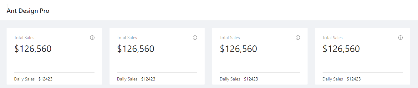
ChartCard can make a neat little block to hold your numbers and charts. See example:
@app.page('/dashboard', 'Dashboard')
def dashboard_page():
return [
    Row([
        Column([
            ChartCard('Total Sales', '$126,560', 'The total sales number of xxx', height=50,
                footer=[Statistic('Daily Sales', '$12423', inline=True)])
        ]),
        Column([
            ChartCard('Total Sales', '$126,560', 'The total sales number of xxx', height=50,
                footer=[Statistic('Daily Sales', '$12423', inline=True)])
        ]),
        Column([
            ChartCard('Total Sales', '$126,560', 'The total sales number of xxx', height=50,
                footer=[Statistic('Daily Sales', '$12423', inline=True)])
        ]),
        Column([
            ChartCard('Total Sales', '$126,560', 'The total sales number of xxx', height=50,
                footer=[Statistic('Daily Sales', '$12423', inline=True)])
        ]),
    ])
]
It creates a page like this:
If you just want to display some text, use Paragraph. You may set the color of the Paragraph:
Paragraph("The text of Paragraph", color="red")
If you wish to format rich text or other complex content, you may use RawHTML Element. Beware this is dangerous because if you pass unfiltered user text (e.g. from a piece of user inputted text stored in the database), this user text may contain dangerous code that may run on the client’s computer:
RawHTML('a raw <font color="red">HTML</font>')
Here’s the list of layout-related classes:
-
class
adminui.Card(title=None, content=None, id=None)¶ A white-boxed container to hold content in sections
Parameters: - title – the title of the card container
- content – list of page elements inside the container
-
class
adminui.Header(text='', level=4, id=None)¶ Display a header text on the screen
Parameters: - text – text body of the header
- level – the header level. level=1 means a first level header(h1)
-
class
adminui.Paragraph(text='', id=None, color=None)¶ Display a paragraph of text
-
class
adminui.Row(content=None, id=None)¶ Display a row with multiple Columns for layout purpose
the width of the row will be automatically calculated by len(content). e.g. a row with four columns will make a 4-column layout. It is also adaptive in small screens and mobile devices.
Parameters: content – a list of Column objects
-
class
adminui.Column(content=None, size=1, id=None)¶ Column in the Row for multi-column layout
Parameters: - content – a list of page elements
- size – the “weight” of the column width. for example, 2 columns with both size=1 will have the same width; but a column with size=2 and one with size=1 will make a 2:1 layout.
-
class
adminui.ChartCard(title=None, value=None, tooltip=None, footer=None, content=None, height=46, id=None)¶ A card container with values, tooltips and a footer. Mostly used in dashboards
Parameters: - title – the container title
- value – (str), the big text shown on the card
- tooltip – the text shown when the user hover on the tooltip icon
- footer – list of page elements shown on the footer of the card
- content – list of page elements shown as the content of the card
- height – the height of the card, to make it looks consistant across columns
-
class
adminui.Statistic(title='', value=0, show_trend=False, inline=False, id=None)¶ A piece of text for showing a statistic number, may include a little trend arrow (up or down)
Parameters: - title – the title of the statistic number
- value – the number itself
- show_trend – if set True, a upper arrow will appear for positive numbers, and a down for negative numbers
- inline – if set True, the title and the value will be in the same line and the font size will be smaller